Three brands stand on the same shelf with the same product, the same price, and the same shelf position. One uses a matte mylar bag. One uses gloss. One uses holographic. They will not sell at the same rate — and the difference isn’t accidental. Finish affects perceived quality, perceived price, and pure attention-grabbing power. The question isn’t which finish is best in the abstract; it’s which finish is best for your product, in your category, at your price point. Here’s how to think about it.
What Each Finish Actually Is
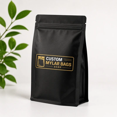
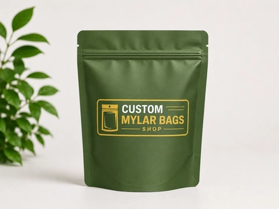
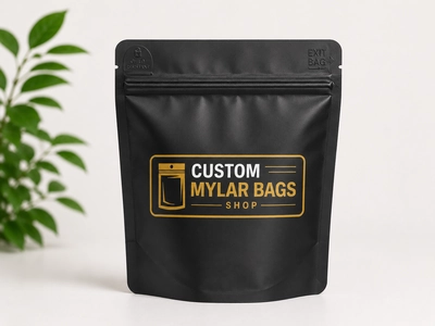
Matte
A non-reflective coating that softens the surface and reduces glare. Reads premium and modern. Colors appear slightly muted, with more sophisticated tones. Hides fingerprints and minor scratches. Photographs cleanly under almost any lighting.
Gloss
A high-shine clear finish that reflects light and intensifies color. Vivid, food-forward, and energetic. Makes printed images look saturated and appetizing. Shows fingerprints, scratches, and lighting reflections clearly. Photographs hot under studio lighting.
Holographic
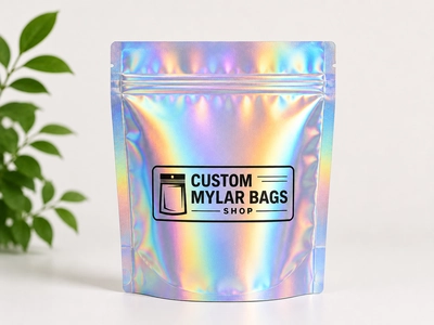
An iridescent metallized film that refracts light into shifting rainbow patterns. Built into the film itself rather than a top coating. Attention-grabbing at distance, premium when paired with strong artwork, gimmicky when used carelessly. See our full custom holographic mylar bags for what this actually looks like in production.
The Category Match-Ups
Different categories have different visual conventions, and shoppers in each one have learned to associate finish with quality cues. Working against those cues is sometimes brilliant and sometimes just confusing.
Specialty Coffee
Winner: Matte. The third-wave coffee aesthetic — minimalist, considered, design-forward — lives in matte. A high-gloss coffee bag reads dated and mass-market. Matte with selective gloss accents (spot UV on the logo, for instance) is the current premium move.
Snacks and Confectionery
Winner: Gloss. Food packaging benefits from high color saturation, and gloss amplifies it. The vibrancy of a glossy chip bag or candy pouch triggers the appetite cues shoppers are scanning for. Matte snacks can work for “artisan” positioning, but mainstream snacks generally sell better in gloss.
Cannabis Flower and Pre-Rolls
Winner: Holographic (with caveats). Cannabis is one of the few categories where holographic finishes have become genuinely mainstream rather than gimmicky. The visual differentiation matters in dispensaries where dozens of similar SKUs sit side by side. Pair holographic with disciplined typography or it tips into chaos.
Edibles and Cannabis-Adjacent
Winner: Mixed. Edibles split between gloss (food-cue positioning) and matte (premium / adult positioning). Holographic works for novelty SKUs and limited drops. The choice depends on whether you’re selling a candy alternative or a wellness product.
Supplements and Protein
Winner: Gloss for mainstream, matte for premium. Mass-market supplements (Walmart, Target) sell better in gloss; high-end supplements (specialty retail, DTC) sell better in matte. The cue is simple: gloss says “effective and accessible”; matte says “curated and considered.”
Pet Treats
Winner: Gloss for mass, matte for premium. Big-box pet aisles are gloss-dominated for the same reason as snacks — color saturation pulls eyes. Premium pet brands targeting the specialty channel use matte to differentiate.
Tea and Herbal
Winner: Matte. Tea customers respond strongly to calm, considered packaging cues. Matte with hand-illustrated artwork is a winning combination in this category.
Cosmetics and Beauty
Winner: Matte (mainstream) or holographic (Gen Z / TikTok). Holographic has become a genuine sales driver for beauty products targeting younger shoppers, where the “does it look good on camera” test matters as much as the “does it look good on a shelf” test.
The Photography Test
Most product sales happen online before they happen in retail, and finish affects ecommerce performance as much as in-store performance. Matte photographs forgivingly. Gloss reflects studio lights and often needs careful retouching. Holographic photographs differently in every shot, which can be a feature (for video and lifestyle content) or a bug (for clean catalog photography).
If your sales channel is heavily ecommerce, factor in production photography costs and complexity. Matte is the cheapest to shoot well; holographic the most expensive.
The Touch Test
Shoppers pick up packages before they buy them, and finish affects how the package feels in hand. Soft-touch matte (a velvety-feeling matte variant) has become a premium signal across categories — the surface tells the customer “this is worth more” before they read a single word. Standard matte feels neutral and refined. Gloss feels slick and energetic. Holographic feels textured and substantial.
This is the unsung variable in finish selection. If you want your packaging to do work after a shopper touches it, soft-touch matte is the format that pulls the most weight.
When Finish Backfires
A few patterns we’ve seen go wrong:
- Holographic on a serious wellness product — the rainbow finish undercuts the credibility the brand is trying to establish.
- Matte on a kids’ product — children’s categories want bright, energetic, gloss-vivid packaging. Matte reads adult and dampens the appeal.
- Gloss on a sustainability-positioned product — high-shine finishes feel synthetic, which works against any eco messaging. Pair sustainability claims with matte or natural-look finishes like our compostable bag options.
- Holographic without disciplined typography — when both the background and the type are doing visual work, neither one wins. Pair holographic with restrained, high-contrast type.
Mixing Finishes Across a Product Line
Many of the strongest custom mylar lineups use different finishes for different SKUs to create a visual hierarchy: matte for the core line, gloss for seasonal or flavor-forward products, holographic for limited drops and collaborations. That approach lets your packaging itself signal which products are everyday versus special — and it works because the format is fully custom, so you can mix without committing to a different supplier for each finish.
So Which One Sells More?
Honest answer: it depends on the category, the price point, the shelf environment, and the customer. There isn’t a universal winner. What we can say with confidence is that the wrong finish for the category reliably underperforms — a matte snack bag in a vibrant snack aisle, a glossy specialty coffee bag in a third-wave coffee shop, a holographic supplement bottle in a wellness store. Match the finish to the category cues, and the finish does its job.
Try It Before You Commit
Before printing a full run, request samples in multiple finishes to compare them in your actual retail environment. Most brands are surprised by which one wins once they see all three in context. Browse our custom mylar bags for finish options across every format, or read our design mistakes guide for the artwork decisions that work together with finish to make or break shelf performance.