Great packaging doesn’t just look good in a render — it survives a busy shelf, a quick smartphone glance, and the moment a shopper picks up three options and decides which one to keep. We see hundreds of custom mylar bag designs come through every year, and the same handful of mistakes keep showing up. Each one is fixable before you go to print. Here are the seven that hurt brands most, with the practical fix for each.
1. Designing for the Computer Screen, Not the Shelf
This is the single most common mistake. Your bag looks beautiful at full resolution on a 27″ monitor, then arrives at retail and disappears next to its neighbors. The problem isn’t the design — it’s that nobody tested it at actual size against actual competitors.
The fix: Print a full-size mockup, tape it to the shelf where it’ll live, and stand 6 feet back. Can you read the product name? Can you tell what flavor or variant it is? If you can’t, your customer can’t either. Brand name should be readable at arm’s length; variant or flavor should be readable from across an aisle.
2. Burying the Product Name Under Decorative Type
Designers love expressive typography. Customers reaching for groceries don’t. When your logo is a stylized wordmark and your product name is in a script font and your variant is in another decorative typeface, every layer of style adds milliseconds of decoding — and on a shelf, milliseconds are everything.
The fix: One showpiece typeface, one workhorse typeface. Use the showpiece for the brand name. Use the workhorse — a clean, high-legibility sans-serif — for the product name, variant, and weight. Reserve decorative type for accents, not core information.
3. Choosing the Wrong Format for the Product
A premium coffee in a thin, flimsy stand-up pouch reads cheap regardless of what’s printed on it. An everyday snack in a stiff, premium box pouch feels overpriced before the customer picks it up. Format communicates positioning faster than artwork does.
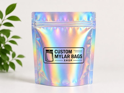
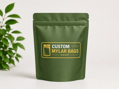
The fix: Match format to category expectations. Specialty coffee, tea, and gourmet dry goods generally read best in flat-bottom bags. Snacks, supplements, and pet treats fit naturally in stand-up pouches. Attention-grabbing categories like cannabis novelty and confectionery benefit from holographic mylar bags. Choose the structure first, then design into it.
4. Ignoring How the Bag Looks From Above
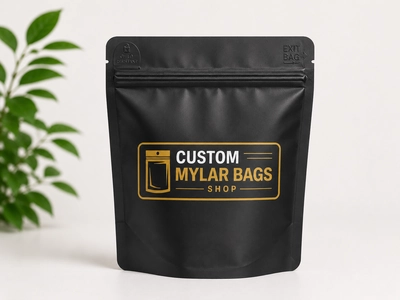
Many retail displays show bags from a 45° angle or from the top down — bins, baskets, hanging displays, fridge shelves. If your design only works face-on, you’ve lost half of your real-world impressions. The top portion of the bag, including the zipper area, is prime real estate that most designs leave blank or fill with decoration.
The fix: Treat the top 2″ of the bag like a second front. Put the brand name, product name, or category descriptor there so a customer looking down into a bin can identify it instantly. This is especially critical for products sold in coolers, baskets, or freezer displays.
5. Printing Without White Underlay on Metallized or Holographic Film
Mylar isn’t a printing substrate the way paper is. When ink goes directly onto a metallized or holographic surface, colors come out muddy, brand colors look wrong, and skin tones in product photography turn alien. The fix — a white ink underlay beneath full-color art — is invisible to the customer and obvious in the final result.
The fix: Ask your printer whether full white underlay is included in the print quote (it should be, for any printed area that needs to read true to brand colors). Designs that intentionally let the metallic shine through (like accent shapes or transparent windows) should be planned, not accidental.
6. Forgetting Required Information Until the Proof Stage
Mandatory copy varies by category — ingredients lists, allergen warnings, nutrition facts, weight statements, batch codes, expiration dates, warning labels, regulatory text, recycle marks, and bar codes. Brands routinely design beautiful packaging and then discover at the proof stage that there’s nowhere to put 200 words of legally required text without breaking the layout.
The fix: Before design starts, list every piece of required text and the minimum legible point size for each. Designate a panel — usually the back — for compliance copy. Bonus: if your category requires child-resistant packaging or specific warnings, build them into the first design pass, not the last.
7. Picking a Finish Without Considering Your Product Photography
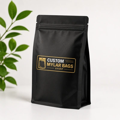
Finish — matte, gloss, or holographic — affects how the bag looks and how it photographs. Matte hides fingerprints and reads premium but reduces color vibrancy. Gloss is vivid and food-forward but shows every scratch and reflects studio lighting in product photos. Holographic stops shoppers in their tracks but is the hardest to photograph cleanly.
The fix: Decide where the bag has to perform — retail shelf, social media, ecommerce hero shot, all three — and choose the finish that wins where it matters most. We break this down by category in matte vs gloss vs holographic mylar bags.
Bonus: The Mistake That Affects All Seven
The meta-mistake under all of these is treating packaging as a final-stage afterthought rather than a product decision. Brands that win with custom mylar bring packaging into the conversation at the same time as the product itself — choosing format, size, mil thickness, and finish before locking in artwork, instead of after. That order of operations is what lets every other decision compound rather than fight.
A Quick Pre-Print Checklist
- Does the brand name read from across an aisle?
- Is the variant or flavor distinguishable at a glance?
- Does the format match the product category’s positioning?
- Have you checked the top-of-bag visibility?
- Is white underlay included on metallized or holographic areas?
- Are required compliance and warning texts laid out, not crammed?
- Will the finish photograph well in your hero shots?
- Have you printed a physical mockup and tested it on a shelf?
Most of these mistakes don’t show up until the first production run lands on the shelf — and by then they cost real money to fix. Catching them in the proof stage is the difference between a launch that pays for itself and one that quietly underperforms.
Get Help Before You Go to Print
If you want a second pair of eyes on your design before you commit, our team reviews custom mylar bag artwork as part of every quote. We’ll flag legibility, format fit, white underlay, and finish issues before they cost you. Browse the full range of custom mylar bags, or request a quote with your artwork attached — we’ll tell you what we’d change. For deeper background, our complete guide to custom mylar bags covers the technical foundations these design decisions sit on top of.